 WebMD: Symptom Checker
WebMD Shows What Symptom Checkers Can—and Cannot—Tell You
Symptom checkers are moving beyond lists of possible illnesses. WebMD shows the enduring value of guided questions, and the limits of advice that stops short of care.
A symptom checker is most useful before you know whether you need one. That is also the category’s central problem: people arrive anxious, with an imprecise description of what hurts, and expect an app to turn uncertainty into a sensible next step. WebMD: Symptom Checker makes the traditional approach easy to recognize: describe a symptom, answer questions, review possible explanations. Its bigger significance is what that familiar sequence reveals about a changing standard. Users no longer need only a list of conditions; they need help deciding what to do, with clear limits on what a phone can tell them.
That distinction matters because symptom checkers occupy an awkward space between reference book and healthcare service. They are not clinicians, and a polished screen cannot make them so. Yet a search box that simply returns a cluster of alarming possibilities can leave a worried person worse off than before. The strongest products in this category have to manage both information and emotion: ask questions in a usable order, make uncertainty visible, and direct people toward appropriate care without pretending to diagnose them.
The old baseline still matters
The baseline expectation is now straightforward. A health app should let someone begin with a symptom in ordinary language, narrow it down through follow-up questions, and find useful information without mastering medical terminology. It should also distinguish an emergency from a concern that can wait, explain what its guidance can and cannot do, and avoid presenting a possibility as a verdict. These are not premium extras. They are the minimum conditions for earning trust in a sensitive setting.

See More Apps by WebMD: Symptom Checker


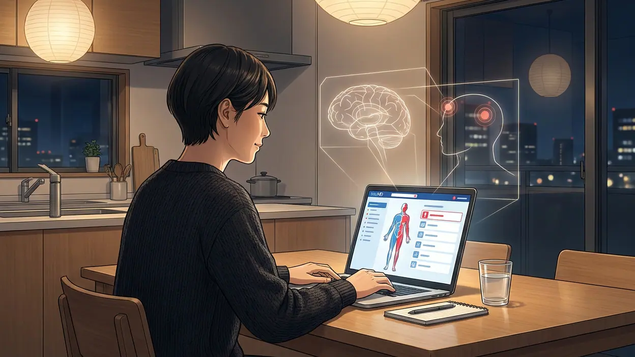
WebMD’s guided symptom flow reflects the appeal of a structured interview over a blank search field. Rather than asking users to invent the perfect query, the checker leads them through choices about what they are experiencing. That structure can make the process feel more manageable, particularly when a symptom is hard to describe. It also imposes a cost: every question becomes a small test of whether the app has understood the person’s situation. A useful path depends on questions being relevant, plain, and not so rigid that real-life symptoms fail to fit.
The product’s strongest signal is therefore not that it can name a condition. It is that the interview itself is the product. A search result can dump information onto the screen; a guided exchange gives the user a sequence to follow. That is a meaningful design choice for someone who might be tired, worried, or unfamiliar with health language. The best version of this interaction helps people describe what is happening before it asks them to interpret it.
But a guided flow is only as good as its handoff. Once people reach possible explanations, they need to understand how tentative those suggestions are and what action follows. A list of conditions, even when paired with background reading, does not automatically answer the practical questions: Should I call someone? Is this urgent? What details should I keep track of? The category’s next step is less about producing a more confident-sounding answer and more about connecting an answer to a safe, comprehensible plan.
Familiar conventions, new pressure
WebMD follows a familiar convention of consumer health products: make medical information available on demand, then let the user decide how to use it. Its recognizable health-reference role gives the symptom checker context; it feels like part of a larger information destination rather than a mysterious diagnostic machine. That continuity is useful. People often want to read more after an initial check, and a known reference source can make exploration feel less like a trip into an unmoderated search-results maze.
The same convention is also showing its age. Information is not the scarce resource it once was. A person can find lists of causes in seconds, but those lists may be difficult to interpret, poorly matched to the situation, or frightening out of proportion. A reference-first experience risks treating the user’s job as reading harder. The emerging expectation is that an app should help organize the next decision, while still making clear that it cannot replace a professional assessment.
That is the convention WebMD challenges indirectly: the assumption that health guidance is complete once relevant content has been surfaced. A symptom checker has to be judged not only by what it says, but by what a person can do after reading it. When the flow leaves someone with more possibilities but no clearer sense of urgency, it has completed a search without completing the task. This is where category leaders will have to prove their value in the experience, not merely in the size of their information library.
Related apps show how the surrounding expectations are changing. MyChart and FollowMyHealth® represent a different kind of utility: access to a healthcare organization’s records, messages, appointments, and other patient-facing services. They are not direct substitutes for symptom checking, and they depend on a connection to a provider. Still, they establish a useful benchmark. People increasingly expect health software to help them act within care, not just read about it. A checker that cannot move information or decisions toward a clinician can feel isolated from the rest of the journey.
Anatomy Learning - 3D Anatomy points to another expectation: when a subject is spatial, interactive visual explanation can be more intuitive than text alone. It does not answer whether a particular ache is serious, but it reminds health-app designers that information presentation affects comprehension. Period Tracker and Calendar, meanwhile, reflects the value of continuity. Tracking patterns over time can give users a record to consult or share, rather than forcing them to reconstruct every detail at the moment of concern. These apps sharpen the contrast: symptom checking is often a one-off encounter, while users increasingly expect health tools to remember context responsibly.
None of those comparisons means a symptom checker should turn itself into a medical record, a 3D anatomy lesson, or a tracking diary. The point is that the category is being judged against a broader standard of usefulness. Users have seen apps that connect information to records, show complex material visually, or preserve a timeline. A checker that asks questions and then leaves the user alone with an interpretation now looks like one piece of a larger experience, not a complete solution.
What the next standard should be
The emerging standard is a trustworthy handoff. A checker should make its uncertainty legible, give advice at the right level of urgency, and help users carry the relevant details into a conversation with a health professional. It should explain why it is asking sensitive questions, make it easy to correct an answer, and avoid implying that a neat result is a diagnosis. In this model, restraint is part of intelligence. A tool that knows when to stop speculating may serve people better than one that confidently names more possibilities.
WebMD’s recognizable guided format gives it a solid starting point, but the category still lags in the space between an answer and action. Medical language can be hard to translate into everyday choices. Risk guidance has to be clear without either minimizing danger or sending every uncertain user toward urgent care. Personal context is another challenge: age, existing conditions, medications, and symptom duration can change what guidance means. Gathering that context raises its own questions about privacy, burden, and how much authority users should grant an app.
There is also a human cost to poorly calibrated reassurance or alarm. A vague result may send someone into a late-night cycle of reading increasingly severe possibilities. An overly soothing result could delay care. The interface cannot remove uncertainty, but it can make the boundaries of its advice visible and put urgent instructions where people can find them. The standard should be measured by whether a user leaves better equipped to make a safe decision, not by whether the app produced a satisfying label.
That consequence is practical. A good checker can help someone describe symptoms more clearly, notice which details matter, and decide when a professional conversation is warranted. It can lower the friction of taking a concern seriously without inflating every minor discomfort into a crisis. A weak one can make the user responsible for interpreting a pile of possibilities they came to the app hoping to sort out. The difference is not cosmetic: it determines whether the app reduces confusion or simply gives it a more polished interface.
WebMD: Symptom Checker remains compelling as a familiar, guided entry point into health information, and that basic format still has value. But category expectations have moved past access alone. People want a checker to be careful about uncertainty, sensitive to context, and useful at the moment they have to choose what happens next. The future belongs neither to a magic diagnosis button nor to another endless library of conditions. It belongs to tools that ask better questions, explain their limits plainly, and make the next human step easier.
You May Also Like

 Netflix
 vs. the Rest: The Best Streaming App for Series, Not Every Household
Netflix makes choosing and watching a series remarkably easy, but its value depends on your plan, your household, and how much you care about rival catalogs.
 Google Keep - Notes and lists
Google Keep’s Quiet Growth Shows the Appeal of Simpler Notes
As mobile work gets busier, Google Keep keeps winning a simple contest: capture a thought quickly, find it later, and get on with the day.

 Blood Strike: 2.5 Anniversary
Blood Strike’s Loadouts Turn Every Drop Into a Tactical Gamble
A close look at Blood Strike’s custom loadouts: how fast access to signature weapons reshapes its battle royale rhythm, rewards preparation, and narrows the gap between fights.
 Pandora - Music & Podcasts
Pandora’s Music Is Easy to Start, but Harder to Recover
Pandora’s strength is its low-effort path from a seed to a station. Its weak spot is how much confidence it asks you to place in connection, setup, and quiet recovery.

 8 Ball Pool
 Is Built on Rivalries, Rematches, and Routine
A close look at the rivalries, rematches, shared routines, and unanswered safety questions that turn a quick pool match into a persistent mobile community.

 Samsung Music
’s Quiet Strength Is Playing What You Already Own
Its reach comes less from spectacle than from dependable access to a personal library. That simplicity is both the app’s strongest retention engine and its ceiling.