Microsoft Teams Mobile: When Collaboration Becomes Navigation
September 23, 2026
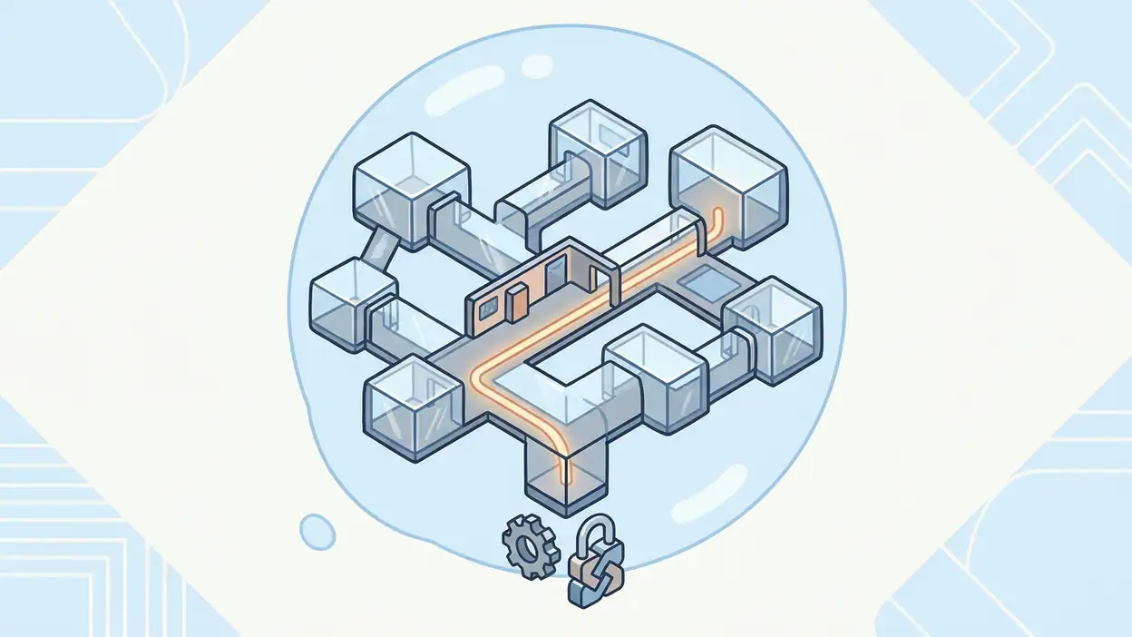
Microsoft Teams is at its best when work becomes unpredictable: a meeting moves, a message needs an answer, a file appears in the wrong conversation, and someone joins from a phone instead of a desk. The mobile app does not eliminate that mess. Its real achievement is making the mess navigable. My central criticism is that Teams understands the complexity of modern work better than it explains that complexity to the person holding the phone. The design is capable, disciplined, and often thoughtful, but it asks users to build a mental map before it becomes comfortable.
That distinction matters. A mobile work app is not judged only by how many tools it contains. It is judged by whether a user can tell where they are, what just happened, what deserves attention, and how to undo a mistake without losing confidence. Teams succeeds in those moments often enough to become dependable, yet its hierarchy can still feel like a filing cabinet designed by committee. The experience is useful because it imposes order on collaboration; it is tiring because that order is sometimes visible before the work itself is.
Microsoft Teams as an interaction design problem
The app's design thesis is clear once you spend time with it: collaboration is organized around places, not just people. Chats, teams, channels, meetings, calendars, files, and activity each represent a different context, and Teams tries to preserve those contexts rather than flatten everything into one stream. That is a sensible choice for business users. A single inbox may feel friendly, but it quickly becomes useless when a project has several workstreams and every decision needs a durable home.

The cost is cognitive. Teams makes users answer a quiet question before many actions: which part of the organization does this belong to? That question gives the product structure, but it also slows down casual behavior. Sending a quick note is simple in a one-to-one chat. Finding the right channel for a quick note requires more judgment, especially on a small screen where the surrounding hierarchy is compressed.
I tested the app with the habits that expose design quality: jumping between recent conversations, joining meetings from notifications, searching for an old file, replying to a message while distracted, and recovering after opening the wrong workspace. Those moments reveal a product that is less interested in looking effortless than in remaining accountable. Teams wants actions to have a location, a history, and a relationship to the wider organization. That is its strength and its recurring source of friction.
First-use orientation
The first-use experience does not feel like an invitation so much as an induction. After signing in, the app presents a working environment shaped by the account's organization, permissions, teams, and recent activity. That is appropriate for a business tool, but it means a new user can encounter a surprising amount of structure before understanding the basic route through it.
The most important orientation task is learning the difference between a chat, a team, and a channel. The interface eventually makes those relationships legible, but not always at the moment they matter. A chat feels immediate and personal. A channel feels shared and persistent. A team contains broader groupings. These are not merely labels; they are rules about visibility, history, and ownership. On mobile, those rules are easy to blur because the screen gives each destination similar visual weight.
Teams does provide useful anchors. Recent conversations reduce the need to navigate from first principles, and notifications can take users directly to the relevant message or meeting. That is good orientation by memory rather than by explanation. The app assumes that people return to familiar places, and it rewards that repetition. A first-time user, however, may understand where they arrived without understanding why that location exists.
Compared with a focused app such as Duolingo, which teaches its structure through a clear sequence, Teams cannot afford a single obvious path. Its users do not share one goal. Some want to chat, others need a meeting, and others are looking for a document buried in a project. The design challenge is therefore not simplicity in the abstract. It is making a complicated workplace feel locally understandable. Teams gets close when it shows the current context clearly; it struggles when several contexts compete for attention.
Navigation and hierarchy
Navigation is where the app's ambition becomes most visible. The main areas are easy enough to recognize, but the hierarchy beneath them can become deep: an organization contains teams, teams contain channels, channels contain posts, posts contain replies, and replies may lead to files, meetings, or another conversation. The structure is logical, yet logic does not automatically produce speed.
The mobile layout relies heavily on recency and entry points. A recent chat is often more useful than a perfect directory because it lets users resume work without reconstructing the organization. Search acts as the escape hatch when memory fails. This combination works well for returning users, but it creates two different products inside the same app. One is a familiar set of shortcuts. The other is a large information architecture that appears whenever the shortcut is missing.
The hierarchy is strongest in channels where the distinction between posts and replies is preserved. That separation gives discussions a sense of place and prevents every message from becoming another item in an endless feed. It can also make the interface feel slower than a conventional messenger. A user who expects a quick stream may wonder why a response belongs inside one thread rather than beside the latest activity. Teams chooses durability over instant readability, and that choice is defensible for work that must be revisited.
Search partially repairs the hierarchy, but search is not the same as navigation. Finding a phrase can reveal a result without restoring the user's understanding of the surrounding project. The app is good at retrieving a needle; it is less good at explaining the haystack. For expert users, that may be acceptable. For everyone else, a result can feel like a temporary landing rather than a confident return to work.
Feedback after actions
Teams generally gives adequate feedback, especially for actions with serious consequences. Sending a message produces an immediate visual change, meeting controls respond clearly enough, and navigation usually confirms itself through selected states and changed content. The app rarely leaves me wondering whether a tap registered at all.
The more interesting question is whether the feedback explains the result. A message can appear in a conversation, but the user may still need to infer who can see it, whether it belongs to a channel post or a reply, and whether the notification reached others. In a business setting, visibility is part of the action. Teams sometimes communicates the act more clearly than its social scope.
Meeting feedback is more successful because the stakes are obvious and the controls are time-sensitive. Joining, muting, turning video on or off, and leaving all require immediate confirmation. The app keeps these actions close to the active call, which reduces the chance of wandering into a different part of the product while attention is divided. That restraint matters. A meeting interface should not make a user remember the entire application model while trying to speak.
Notifications are a mixed case. They are excellent as doors into specific work, but they can also become a second navigation system layered over the first. A notification may bring the user to a message, while the app's own activity area records related events elsewhere. The duplication is understandable, yet it can make attention feel fragmented. Google News is built around a stream of updates; Teams has to distinguish urgent activity from routine collaboration, and it does not always make that distinction feel effortless.
Friction and recovery
Good interaction design is often most visible after a mistake. Teams is reasonably forgiving, but its recovery paths are not always as direct as its primary actions. A user can open the wrong chat, enter the wrong team, or follow a notification into a thread that lacks enough context. Returning is usually possible through back navigation, recent items, or search, but the app does not always restore the exact mental position the user had before the detour.
This is a subtle problem. Physical back behavior may take the user through layers of the current location rather than back to the last meaningful task. That is technically consistent with hierarchy, but not always consistent with intention. If I opened a message from a notification, my goal is often to return to the work I was doing before the notification, not to retrace every screen between the notification and the message.
Editing and correcting messages are handled with the seriousness expected in a workplace. Options are available, but they tend to sit behind menus rather than beside the primary send action. That keeps the composer clean and reduces accidental taps. It also means recovery depends on knowing where secondary actions live. The design favors a calm surface over immediate discoverability.
File recovery exposes a similar tradeoff. Teams can connect conversations with shared documents, but a file's location may feel dependent on the conversation that introduced it. If the original message is forgotten, the user may need to search across chats, channels, and file areas. The app provides several routes back, yet the routes do not always converge into one reassuring answer. A stronger recovery design would make the relationship between file, conversation, and project more explicit at every level.
There is a useful contrast with Microsoft SwiftKey AI Keyboard. SwiftKey treats correction as a continuous, low-friction part of typing: suggestions appear beside the action and invite quick repair. Teams treats correction as a controlled administrative operation. Neither approach is universally better. In a business app, deliberate recovery protects records and accountability, but it can make small errors feel heavier than they need to be.
Consistency across the experience
Teams benefits from a strong visual and behavioral family resemblance. Conversations, meetings, files, and activity areas share enough patterns that repeated use builds confidence. Controls tend to occupy expected regions, icons behave in familiar ways, and the app's language remains recognizably professional. This consistency is not glamorous, but it is what lets a busy user act without re-learning the interface every day.
The weakness is that consistency sometimes operates at the level of appearance rather than meaning. Similar rows can lead to very different destinations. A person, a team, a channel, a meeting, and a file may all appear as tappable entries with comparable visual emphasis, even though they support different actions and carry different expectations. The interface is tidy, but the tidy surface can conceal semantic differences.
Teams also inherits the complexity of a product that has grown across several work modes. Messaging, calling, meetings, file collaboration, and organizational browsing do not always feel like one continuous experience. They feel like neighboring rooms in the same building. The doors match, but the furniture changes. That is not a failure of consistency in the narrow sense; it is a reminder that coherent branding cannot fully erase differences in task logic.
Still, the app avoids the more damaging kind of inconsistency: silent changes in behavior. A user can generally predict that a tap opens something, that a long press or overflow menu reveals more options, and that the active area will be visually marked. Those conventions may not make Teams delightful, but they make it learnable. In professional software, learnability often matters more than charm.
Small-screen decisions
The phone forces Teams to make difficult choices about what stays visible. The app responds by prioritizing the active conversation or meeting and hiding much of the wider structure behind navigation, menus, and search. That is the right instinct. Showing every layer at once would make the product unusable. The problem is that concealment shifts work from visual recognition to memory.
On a large monitor, a user can keep a channel list, conversation, participant panel, and file area in view. On mobile, these become sequential destinations. The user must move between them, remember what was open, and trust that returning will not erase the current context. Teams handles this better than a purely desktop-shaped interface, but it cannot remove the cost of sequential navigation.
The composer is a good example of restraint. The basic act of writing remains prominent, while formatting, attachments, reactions, and other options are available without permanently crowding the screen. This keeps ordinary messaging quick. The downside appears when the user needs to do something slightly unusual, such as format a careful announcement or attach material from a less familiar source. The interface becomes a hunt through secondary controls.
Meeting controls show a more successful small-screen compromise. The app brings essential actions into reach while allowing less frequent controls to recede. That reflects task urgency rather than feature importance. A button does not deserve space merely because it exists; it deserves space because the user may need it under pressure. Teams understands this principle in calls more consistently than it does in the broader workspace.
What expert users notice
Experienced Teams users develop a private map of shortcuts. They know which conversations deserve pinning, which channels are active, which notifications can wait, and which search terms reliably surface old work. That expertise changes the character of the app. Once the map exists, Teams becomes less like a maze and more like a set of well-worn corridors.
Experts also notice the difference between navigating by location and navigating by evidence. They may enter a channel because they know the project structure, or they may search for a phrase because they remember the decision but not its home. The app supports both modes, though it rewards users who maintain organizational discipline. Naming conventions, channel hygiene, and sensible notification settings are not optional polish; they are part of the product's usability.
That dependence on local discipline is both realistic and limiting. Teams cannot repair a chaotic organization through interface design alone. Yet the mobile experience could do more to expose the signals that experts use: why a channel matters, how recently it changed, what kind of content it contains, and how it connects to the user's current work. Expert users have those answers because they have learned them over time. New users are often asked to infer them from sparse visual cues.
The app's stickiness therefore comes less from delight than from accumulated context. Once conversations, meetings, files, and habits live inside Teams, leaving becomes inconvenient because the user's working memory is embedded there. That is powerful product design, but it places a responsibility on the interface to keep that accumulated context understandable. Teams meets that responsibility unevenly.
The strongest design choice
The strongest choice is the decision to preserve context instead of reducing collaboration to a universal message stream. Channels, threads, meetings, and files can feel cumbersome, but they give work a durable shape. A decision made in a project conversation has a better chance of remaining findable than a message lost in a single chronological inbox.
This is where Teams earns its place on a phone. Mobile work is full of interruptions, and interruptions destroy context. By tying actions to conversations, teams, and projects, the app gives users a chance to reconstruct what happened later. The design does not merely help people communicate; it helps organizations remember.
The choice also explains why the app can feel heavier than consumer messaging tools. Teams is not optimizing every interaction for speed. It is optimizing selected interactions for traceability. That is a harder value to feel in the moment, but it becomes obvious when someone asks where a decision was made or which file contains the latest version.
Final design verdict
Microsoft Teams is a serious mobile work environment with a clear design philosophy: put collaboration in context, keep a record, and let users return to the place where work belongs. Its navigation is logical but dense, its feedback is dependable but sometimes vague about visibility, and its recovery paths are adequate without always following human intention. The app is not short of features; it is short of spare cognitive capacity.
That makes the verdict more nuanced than a simple recommendation. Teams is a strong choice for organizations that need conversations, meetings, and shared work to remain connected over time. It is less convincing as a casual communication app because its structure appears before its ease. The more disciplined the workplace, the better the experience becomes.
After extended use, I trust Teams more than I enjoy it, and that is not an insult. Trust is the product's real design achievement. It comes from preserving context, confirming important actions, and giving experts enough routes through a complicated workspace. The next step is to make those routes more legible to everyone else. Until then, Teams remains a capable companion for work in motion: dependable, recoverable, and just a little too aware of its own filing system.